
A

This graphic communication master’s project aims to create an interdisciplinary approach to physics education targeted at Swedish gymnasium students aged 15-17. Specifically, the project will focus on the design of a physics book created to engage students in understanding physics formulas.
In times when logic and scientific reasoning are being unvalidated, it’s more important than ever to enrich established bonds between visual communication and physics to support the interest and validation of scientific meaning and language.
A common belief about studying physics, is that you have to be some kind of genius to understand it. When I’ve talked about making a physics book as my master’s project to family and friends, the reaction has often been “That sounds interesting, but also difficult!” Physics might seem distant to the average person, but we encounter physics in our everyday lives. Physicists are engaged in concepts that are relevant to every person, in questions we all sometimes ask ourselves. “How is our world built? how does it work? and what we are doing in it?”
In international studies, physics is shown to be the subject where students lack the most motivation. One of the reasons is known to be that students struggle with all details within the subject, and struggle to see the point of learning it (Nelsons 2012).
By creating new ways of learning about the fundamentals of physics, this master project makes a significant contribution by using tools from graphic design to create a more welcoming entry point to formulas in physics, especially for students early in their education to abstract concepts and formulas. By doing so it will fulfill the UN’s SDG 4 Quality Education: “To ensure inclusive and equitable quality education and promote lifelong learning opportunities for all” (“Goal 4 | Department of Economic and Social Affairs” 2023).

The title of the physics book series is ‘Paranteser,’ which means 'parentheses' in English and is based on the concept of the symbols: ( ). On the front cover a parenthesis is placed, as well as on the back, which communicates that everything in-between the front and back is content that’s put into parentheses. This concept underlines that the information in the physics book works as an additional context to the main course of physics, as parentheses are commonly used to enclose information that provides clarification, explanation, or additional detail within a sentence (“Parenthesis” 2024). The symbol is also commonly used in physics formulas, which makes it relate to the topic inside on a greater level. The parentheses are a strong graphic element that is a clear symbol if used in a series, it becomes an identifier.

In my physics book, I want the formula to be the centre of attention and everything evolving around it. Usually, a formula is only used in calculations and is occupied in between other dense text about calculating it. There is a lot of visual beauty in a formula to make use of when trying to engage a student in calculations.
From my research, physicists I've met underlined the importance of showing formulas in different contexts that are exciting to students and that relate to their everyday lives. Therefore each formula in the book is presented in the following way:
1. Formula and definition
2. Example of formula in nature
3. Example of formula in technology
4. Example of formula in “helicopter perspective”
The content of the book will follow the course plan of physcis 1 which makes it easy to build knowledge for the student.

As the teacher writes formulas on the boards in front of the class, a line of symbols follows after their pen. I thought about that line of numbers, how it’s almost like a brush stroke, with which they are drawing up the world to make sense of it all. The world is not made out of numbers, but we use concepts of numbers and symbols to understand it in physics.
I created brushes with lines of different physics numbers, symbols, and math operators, and drew my illustrations using these. I created numerical and symbolic brushes for each formula that follows generally the content of the physics book course plan. For further implementation, I created brushes that reflect the content in the physics books 2 and 3 as well which is used from all the covers and illustrations throughout. The brushes are also meant to invite the reader to look closely at the different parts of the illustration, instead of overwhelming the reader with visual imagery, this visual aesthetic is built on curiosity about what the illustration portrays and how it differentiates from the others. By using this approach, the whole book, from cover to formulas and to illustrations has the same source of material: Numbers and Symbols. As the illustrations are all in tones of black, this style makes it easy to reproduce in school on a copy machine if someone forgets to bring their book to class.
In this project I’ve explored how to visually approach challenges to make physics formulas become more approachable to teenagers. The main insight that I’ve gained is that there is not only one right way to approach learning. A new perspective can make one receptive to new knowledge, and the more that perspective relates to their own life, the more likely they are to understand it. The role of visualization is key entry to making relatable and inclusive content that brings the reader closer to the knowledge
Want to read more about this project?
Click here

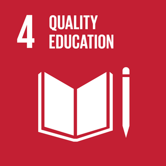


 Foto: Steen Eiler Rasmussen")


