
Type Tricks: User design
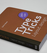
Presenting a research project by Sofie Beier, the third volume in a series of user manuals devoted to typography. Building on its predecessors, which explored type design and layout, this latest installment delves into usability. Crafted in a small and handy format, it ensures easy accessibility, allowing you to have it by your side whenever you need to refer to its content.
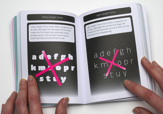
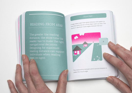
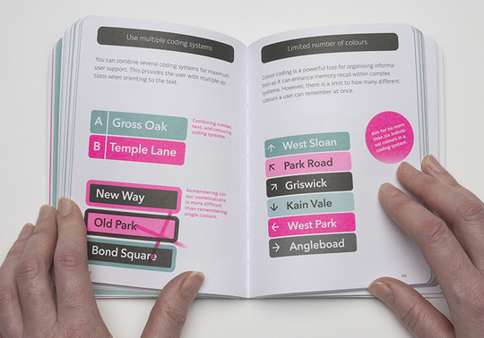
The book serves as a comprehensive dissemination of the author's research on typography accessibility and the essential considerations when selecting fonts for challenging reading scenarios. From signage and small point sizes to glance-like reading or scanning, it covers the needs of diverse readers, including those with low vision, older age, children, or dyslexia. Instead of delving into lengthy academic papers, the book presents these findings in an easily accessible, illustrative manner, making it a valuable resource for various target audiences.
Specifically, this research project caters to:
- Beginner students in graphic communication design, providing them with foundational knowledge and practical insights into typography and its impact on legibility.
- Nonprofessionals who work with lay outing text for specific target audiences, offering them actionable tips to improve readability and communication effectiveness.
- Professionals with a keen interest in the latest developments within legibility research, but limited time to read lengthy academic papers. This book serves as a concise yet comprehensive resource to stay updated with evidence-based findings.
Containing little text but abundant illustrations, the book showcases over 140 tips derived from rigorous evidence-based research. The intention is to empower readers to make informed choices that elevate their communication endeavors.
