
A

Description
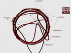
In this project, we seek to explore uncertain, complex data about our changing climate. While graphical visualisations of climate data have become increasingly common, it is less common and perhaps even less acceptable to probe inside of the data system that drives those visualisations or experiment with alternative data representations.
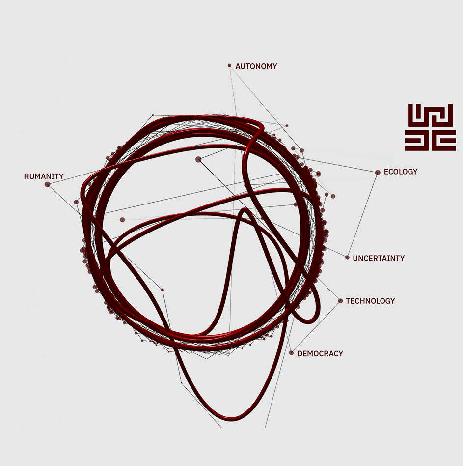
Our research has three purposes. Firstly, we hope to explore the potential for designers to serve as a bridge from variable, complex and difficult climate data to the public audiences. For example, predicting the weather is a service we rely upon heavily, yet we have little understanding of how exactly that weather work actually works.
Secondly, through our research we will gather a collection of climate-related topics that could benefit from data visualisation, focusing on the least visible, most uncertain and underexposed topics. We are conducting this research through expert interviews and desk research in the fields of climate science, ecology, data science, data ethics and data visualisation. Lastly, we ourselves will investigate a topic within the collection with a focus on data visualisation and experiment with the many forms in which these topics and their underlying data could be represented.
As we create the collection and the experiment, we hope to uncover useful ways of questioning data and black box models as well as critical views on instinctive visualisations, documenting inspirational ways of thinking and working for future climate-oriented data visualisation designers and artists.


