The Taste of Colors and Forms
As a graphic designer you are often faced with having to consider and decide on choices of color and form. Basically, most people are able to relate to both color and form and are also able to grasp what kind of attention it may attract. Our senses have the ability to connect matters and draw parallels that may not be that obvious. However, as a designer I still have the idea that a lot of people look at design without even experiencing it unless they are conscious about it. We experience the world through our senses, which provide us with information about our surroundings, experiences, and impressions.
Thesis statement How are relations between color and form created from a sensuous and methodological perspective that is reflected in a strongly sensuous manner of communication through experimental research and physical shaping?
Newer studies of colors look away from the technical part of colors (i.e. science of colors and color psychology) and call attention to the sensuous effect colors have on human beings. Colors and forms constitute a visual language that speaks to our senses. Our senses are common features for all of us, but when talking about senses there is still one particular phenomenon that differentiate people’s experience of the world. Some people experience particular crossings of their senses, which means that they connect certain episodes with other specific incidents. This is called synesthesia. Synesthesia may also be called ‘joint sense perception’ where numerous of one’s senses are active simultaneously. For people not suffering from synesthesia the phenomenon is more related to associations, which is something most people are familiar with. An association resembles synesthesia in many ways as it is about connections of thoughts and ideas as well.


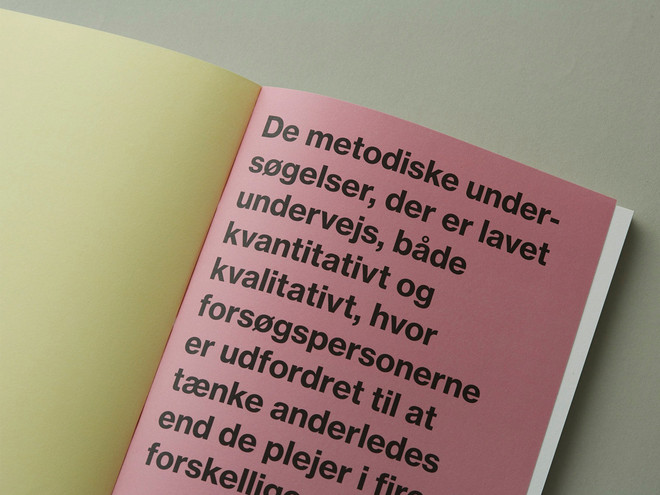
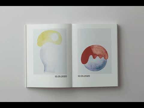
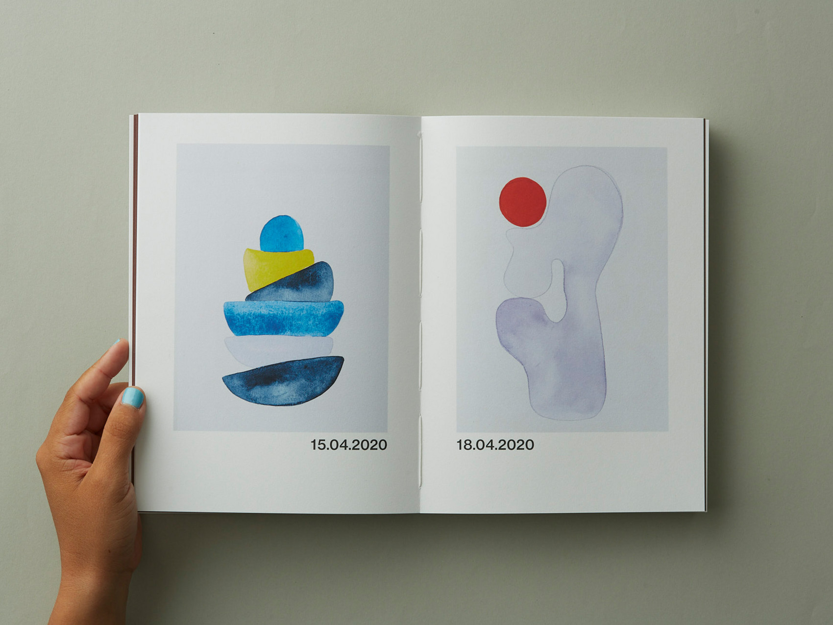
The project’s methodological part began with the theory on synesthesia and with a focus on color and form as source of expression. The project is focused on ‘joint sense perception’ and how to appeal to our senses through physical shaping. It is about taste as a physical object, sight as arbiter of taste, a visualization of taste, and the combination of the sense of taste and the sense of sight. The focus on taste is very interesting because food is often something we gather around as humans, something we share with each other, enjoy together, and thus experience together, which go back to the experience of design. The sense of sight is interesting in the work with visual communication as it, regardless of platform, must catch interest and attention while also being harmonic and balanced, which are two important skills in the work with color and form.
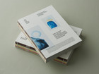
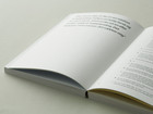
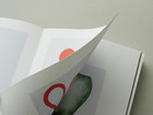
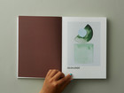
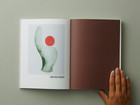
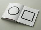
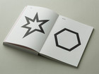
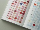
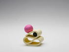
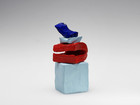
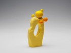
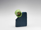
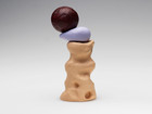
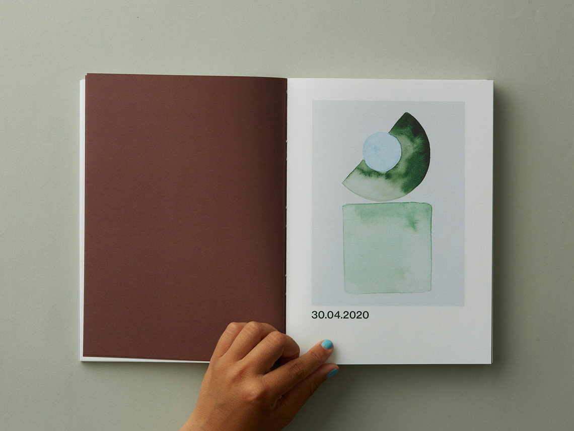
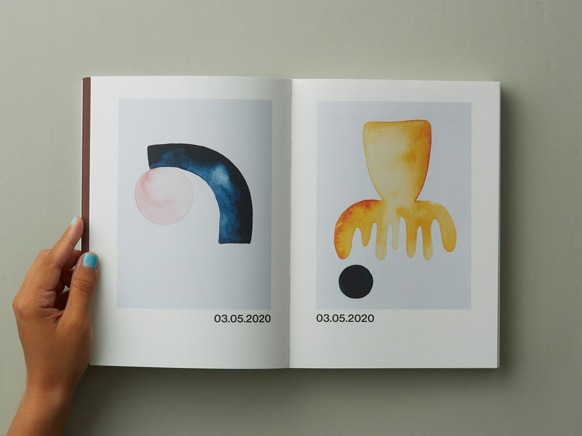
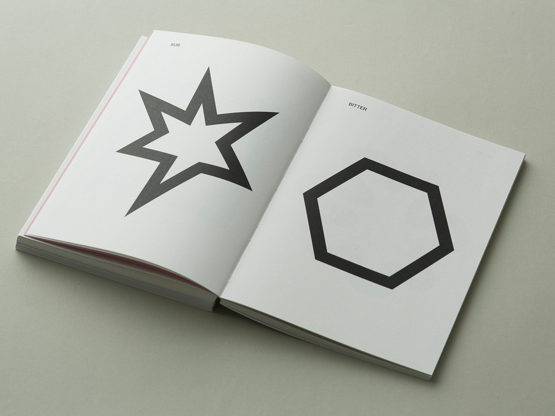
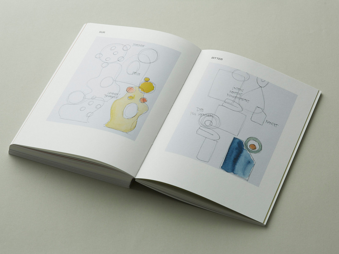
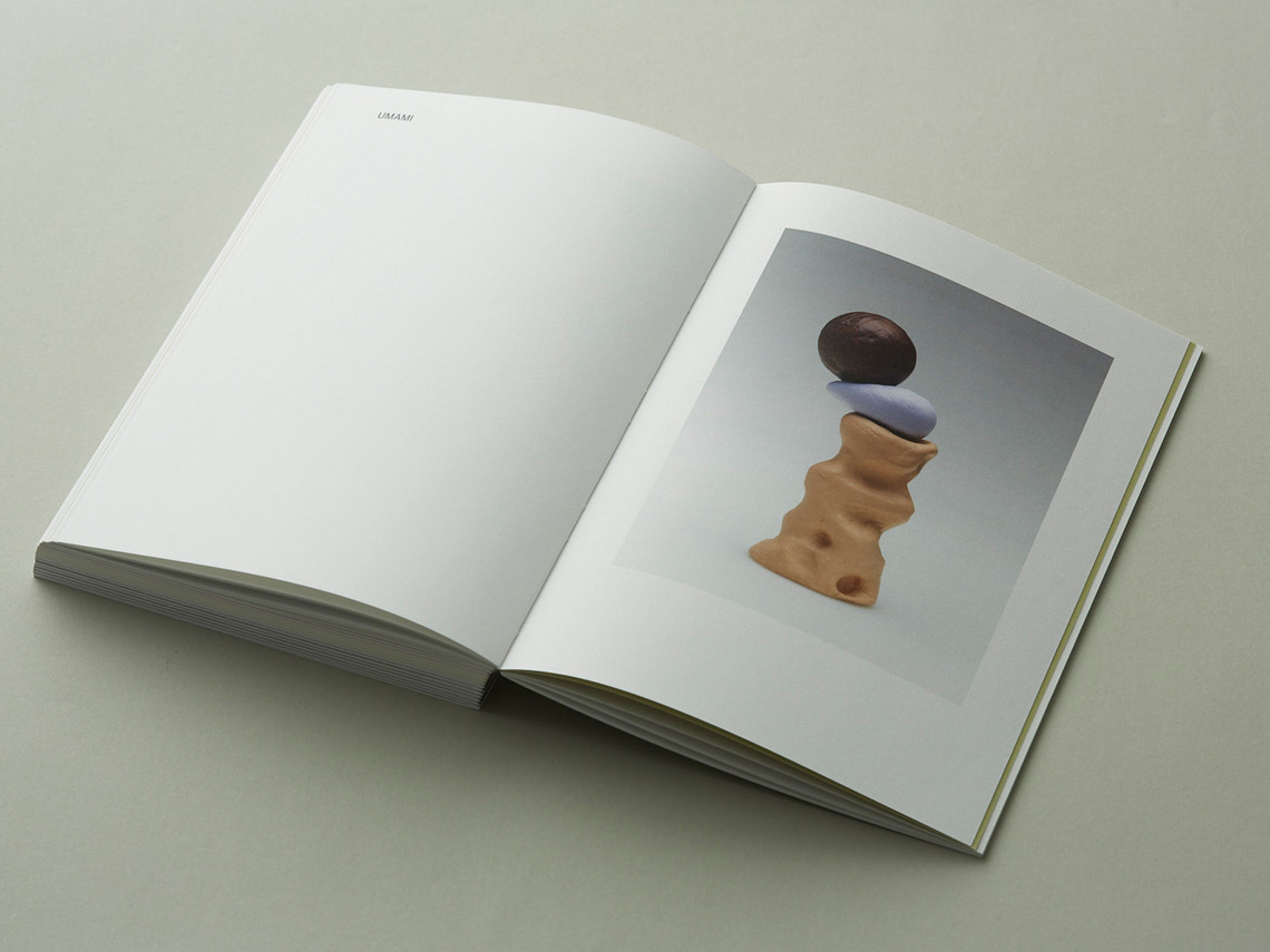
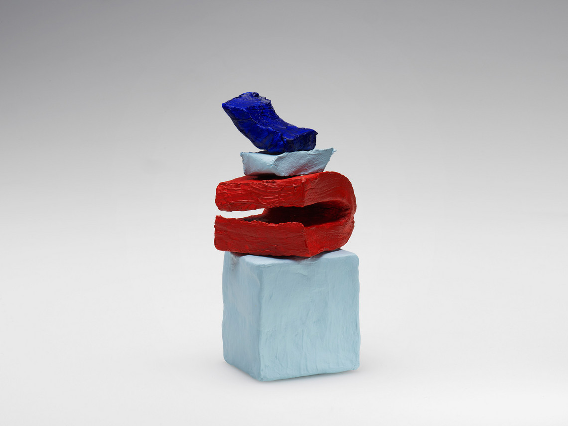
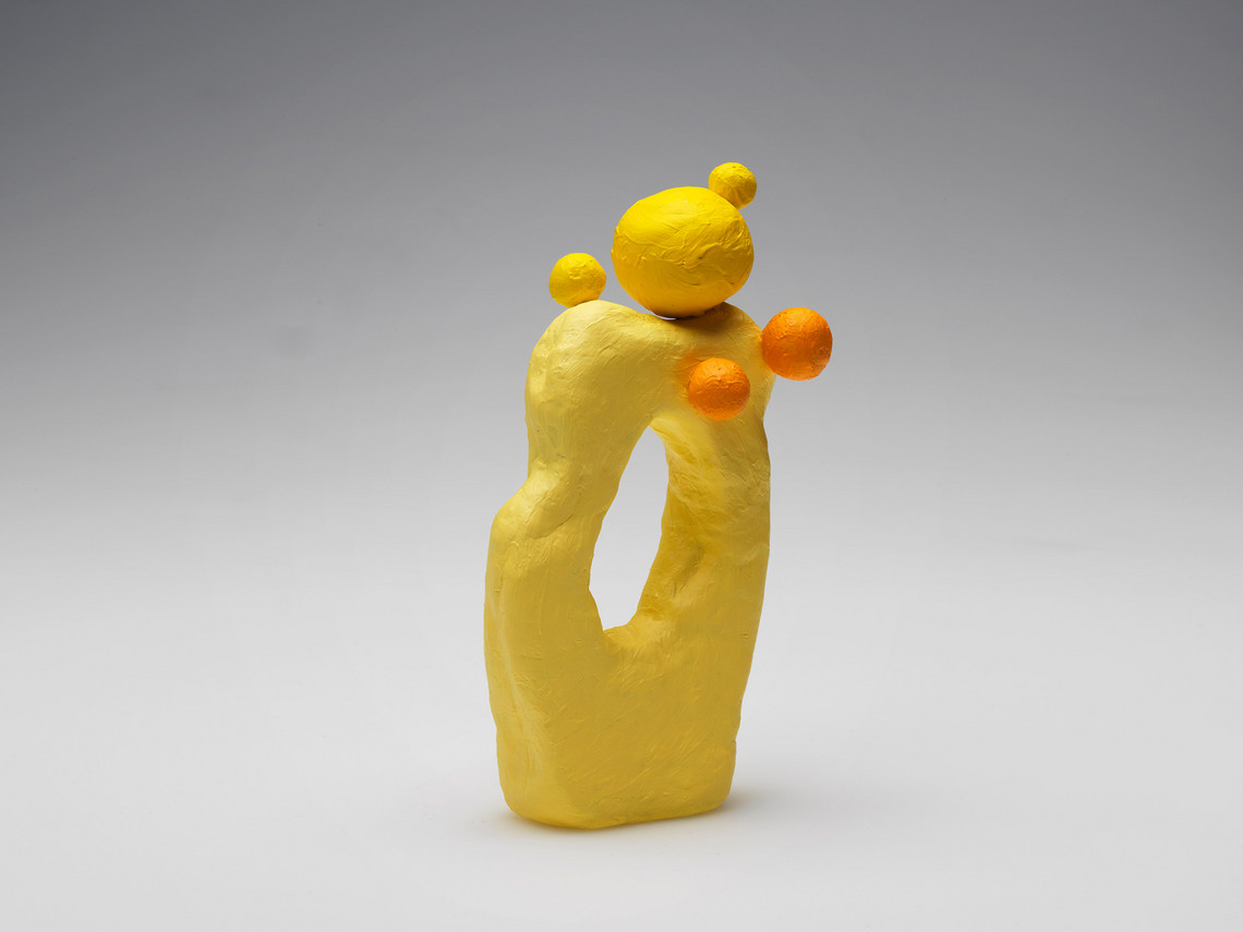
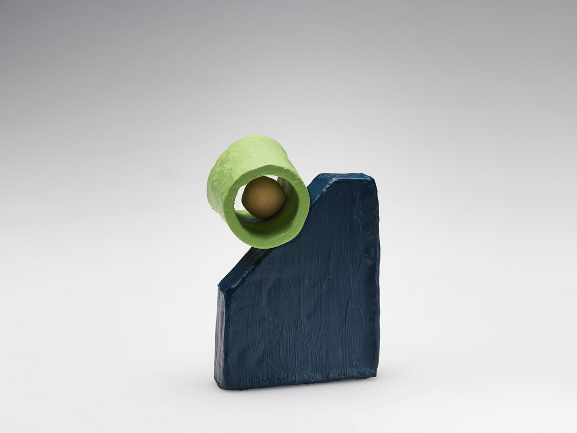
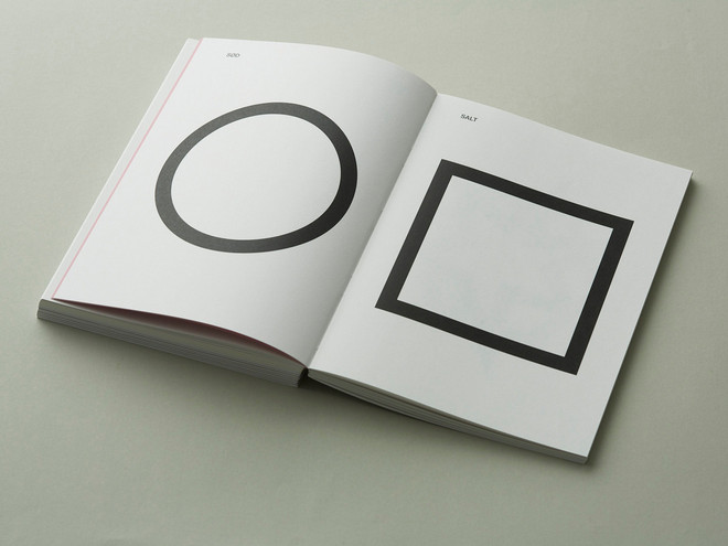
As a means of covering the sense of taste, I have worked with a visualization of the five basic tastes through five physical objects; one for each basic taste, i.e. sweet, salt, sour, bitter, and umami. Due to the complexity of the project and the very abstract aspect, the five objects are supported by a book about the concept that describes the process. The objects and the concept (the book) must be regarded equal parts of the final result.
Det Kongelige Akademi understøtter FN’s verdensmål
Siden 2017 har Det Kongelige Akademi arbejdet med FN’s verdensmål. Det afspejler sig i forskning, undervisning og afgangsprojekter. Dette projekt har forholdt sig til følgende FN-mål


