
A
The project began from the interest in a community garden in that it plays an important role in the city as a place not only connecting people and nature but also helping people bond with common interest and purpose. The project aims to make a visual identity and suggest new products and services for the community garden from the perspective of branding and community design.
How can we make people participate in the community garden and the place to keep active and sustainable through visual materials from the perspective of communication design?
As the main targeting group, Lersøgrøftens Integrationsbyhaver, has a multicultural characteristic, the design direction and strategy focus on how the community can keep its characteristic and how the design can make people engaged in the activities in the garden so that it can help the community garden sustainable in the long run.

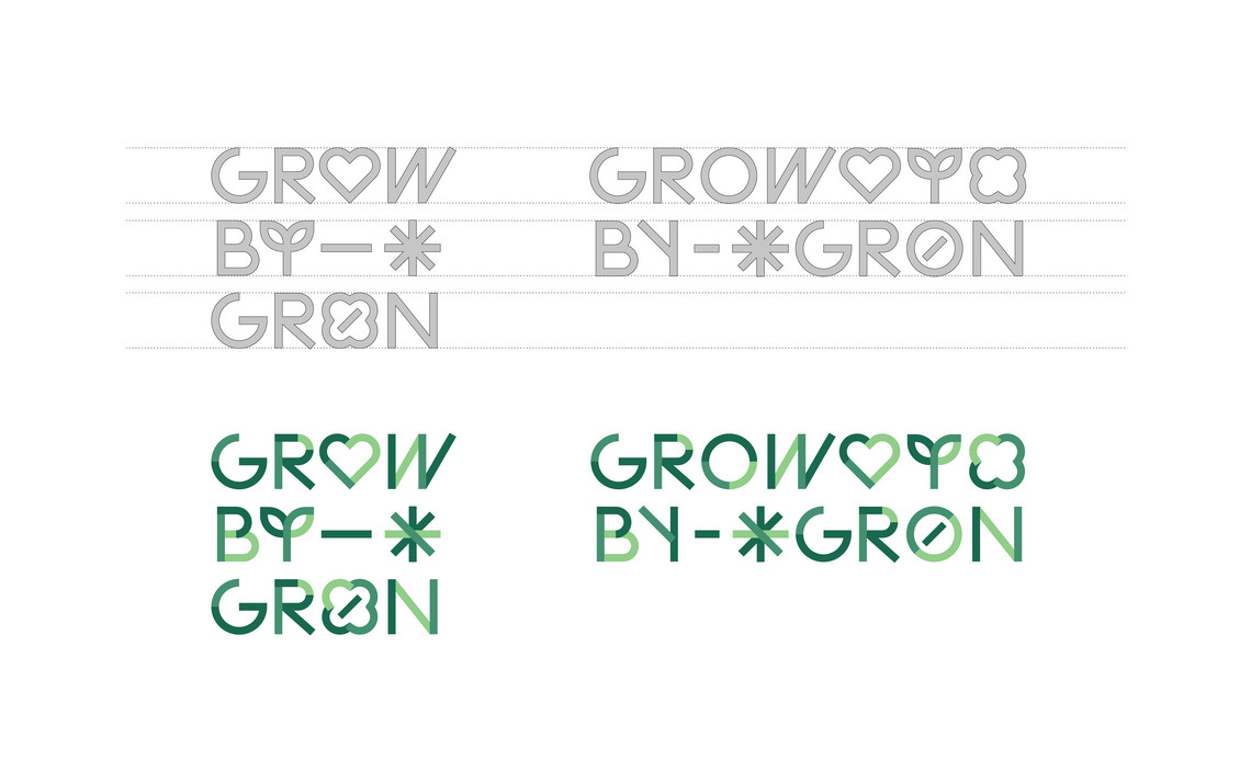
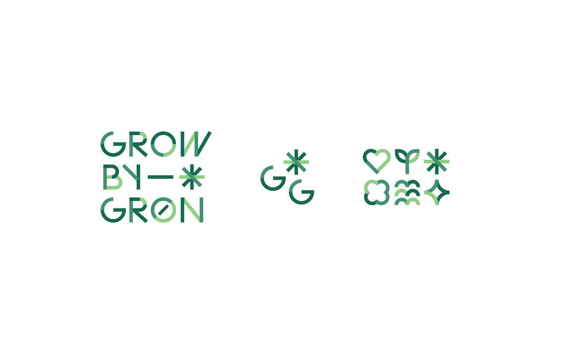
The new name, ‘Grow-By-Grøn’, shows Lersøgrøftens Integrationsbyhaver’s multicultural identity by meaning in both ways in ‘grow by green’ and ‘grow urban green’, depending on which the user's native language background is based on.
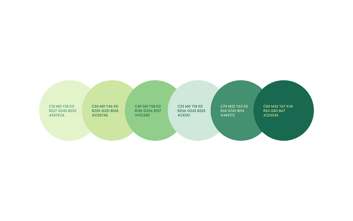
In the colour scheme, it is considered how the colour itself can represent the identity of the community garden. The dominant colour is green since not only it can describe eco-friendly and plant-related products but also the new name of the garden is ‘Grow By(-)Grøn’. However, I used several different shades of green, which can mean that ‘We all are green, although we all are different.’ These various green colours will be used in their purpose and environment by combining each other in a variety of ways.
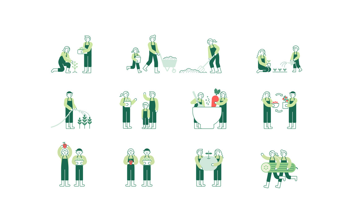
Based on the visual keywords and concept drawn in the early research of the project, the logo is showing the concept of the community garden, the collective people, place, and purpose with various backgrounds. To describe this concept, I used various geometric shapes like circle, diagonal line, or half-circle as a basic visual element. By combining these geometrical figures with each other, I tried to show that a garden is a place where people from various backgrounds and cultures gather to achieve a common vision. The geometrical figures also give a playful and friendly atmosphere with its simple shapes.
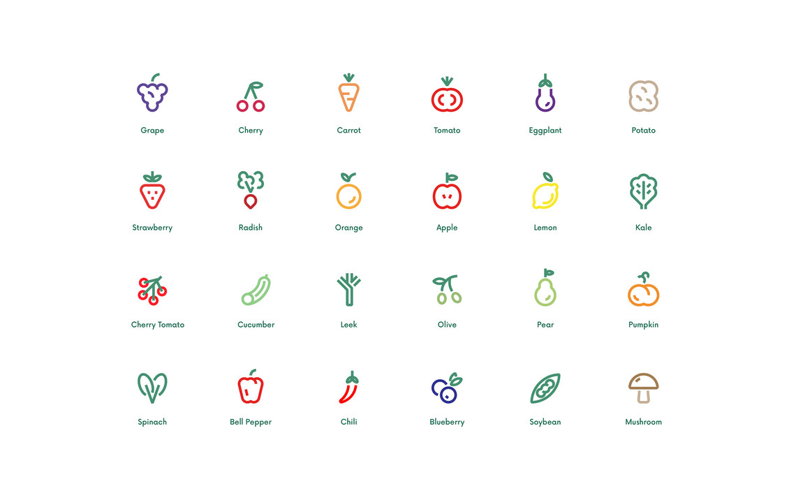
When it comes to applications, there are different kinds of stickers that can give consumers the reliability and organic feeling and it also helps the producer feel the responsibility for the products. The member can just write their name and other information on the sticker or they can just draw their faces or any doodles.
The main packaging method is designed to be inexpensive and environmentally friendly so that people can make the package by themselves even if they have no professional design skills. Rather than making or printing the whole new boxes or bags, people can recycle the old ones and just simply tape it. So even though each bags are different, it still looks consistent by maintaining the same visual language on it.
The welcome-kit can deliver the community’s concept to the members directly, bringing the value and identity and also can play a supportive role in helping the members to adapt to the group. The welcome kit consists of some products that can help people feel a sense of belonging to the community such as a uniform, a canvas bag, pin badges, stickers for the package, and brochures with useful information.


")


