Typeface Legibility

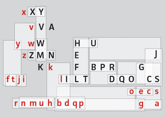
The on going project on legibility looks into the various typographical matters that affect the way we read.

The main concern is a better understanding of how different typefaces affect the reader. With the growing amount of new electronic devices and media, text is not only presented to us in a number of formats never seen before but also needs to function in a wider range of situations than just a few years ago. This, of course, places additional requirements on the design of contemporary fonts and typefaces. With more and more written communication from official authorities and news media and with an ageing population (which means there are relatively more readers with poor vision) it is essential to understand how different typefaces influence the reader and hence efficient communication.
The research project addresses these changes in society by building on existing knowledge about reader behaviour with a particular emphasis on selected research areas within the fields of typeface legibility.
In the history of design, there are many examples of designers proposing an ‘ideal typeface’. The fact of the matter is that there is no optimal typeface style. A thorough literature review shows that typeface legibility varies significantly depending on the reading situation. Consequently, what is legible at a distance is not necessarily the same in longer paragraphs that are to be read at close range.
By improving the legibility of typefaces for normal vision readers, an additional goal is to provide information that can facilitate inclusive design by meeting needs of the low vision readers as well.
Dissemination
- Beier. S., & Dyson, M. (2014) ‘The influence of serifs on 'h' and 'i': useful knowledge from design-led scientific research’, Visible Language, 47(3), 74-95.
- Beier, S. (2013) ‘Legibility Investigations: Controlling Typeface Variables’, Praxis and Poetics: Research Through Design, Conference Proceedings, 92-95, ISBN 978-0-9549587-9-4
- Beier, S. (2013) ‘Typeface legibility: when to use what’, ATypI, 9-13 September, Amsterdam
- Beier, S. (2012) Reading Letters: designing for legibility, BIS Publishers, 1-190
- Beier, S. & Larson, K. (2010) ‘Design Improvements for Frequently Misrecognized Letters’, Information Design Journal, 18(2), 118-137.


