Lost connections. Language-sensitive approach to designing ligatures in type design
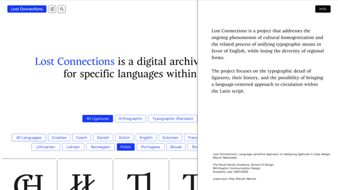
Lost Connections is a project that addresses the ongoing phenomenon of cultural homogenization and the related process of unifying typographic means in favor of English, while losing the diversity of regional forms.
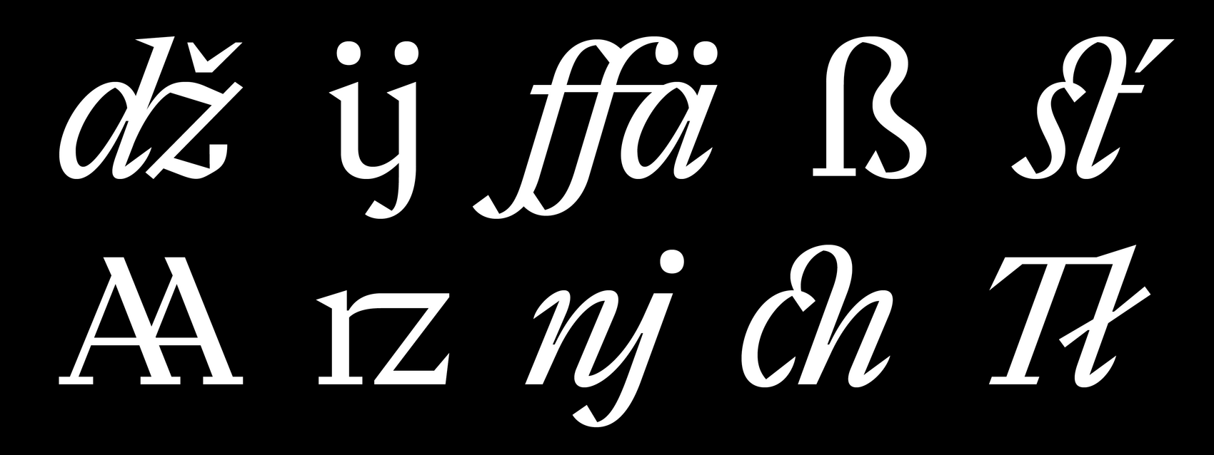
The project focuses on the typographic detail of ligatures, their history, and the possibility of bringing a language-centered approach to circulation within the Latin script.
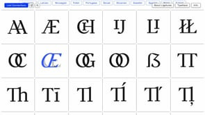
The two integral parts of the project are: a website, which acts as a virtual gallery of ligatures and provides additional information about them, and a typeface, which illustrates examples of various inter-letter combinations.
Typeface
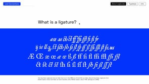
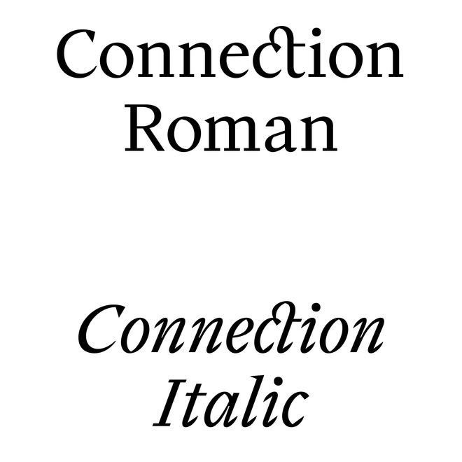
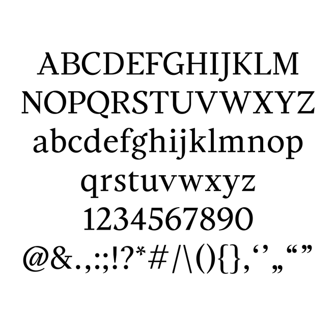
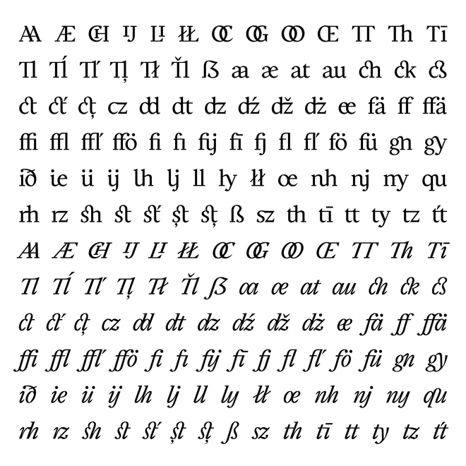
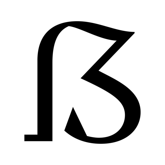
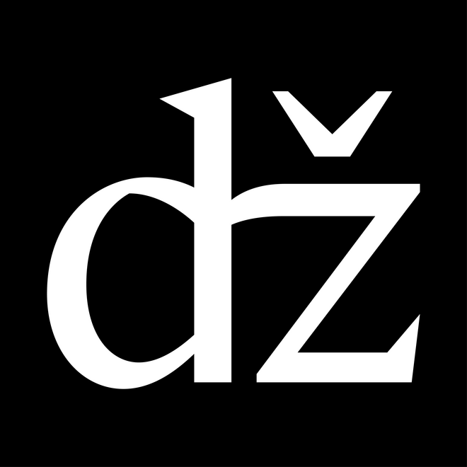
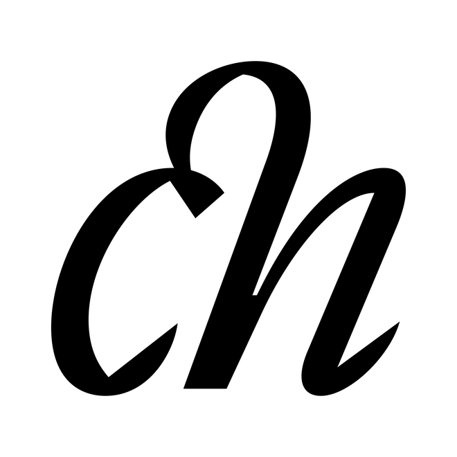
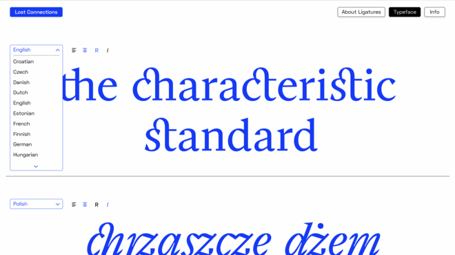
Connection is a serif typeface that combines historic, traditional shapes with a contemporary, digital sharpness. The project was based on in-depth research related to ligatures and their possible use in various languages using Latin script. Available in Roman and Italic, the typeface includes a full set of upper- and lowercase letters, as well as diacritics for Western, Central, and South-Eastern European languages and an extended set of ligatures, both typographic and orthographic, designed for the needs of specific languages.
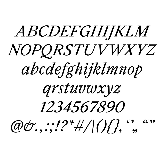

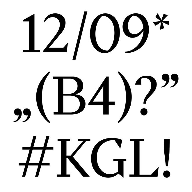
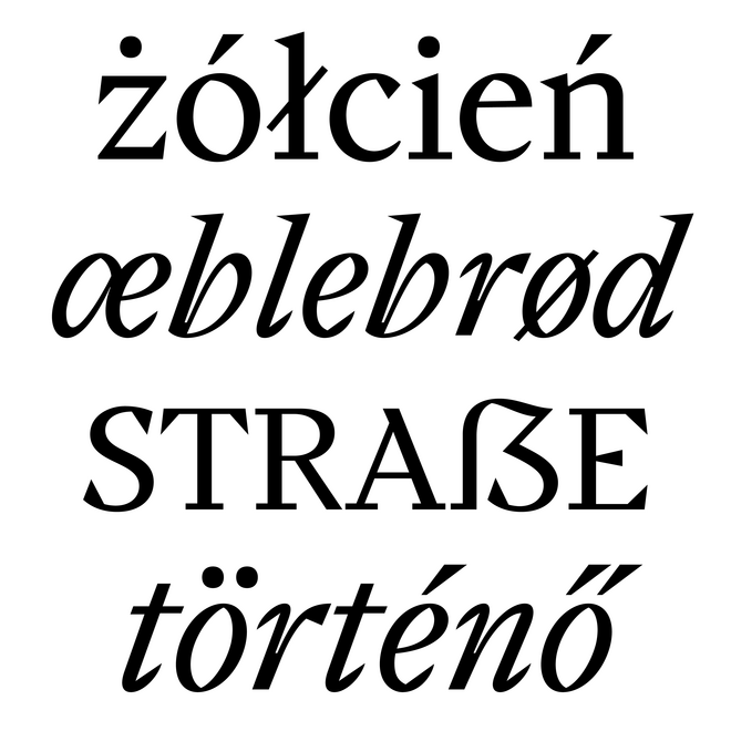

Language-specific ligatures
Language-specific ligatures are those that take into account the needs of particular languages, such as the occurrence of overlapping shapes of adjacent letters, the frequency of character pairs, orthographic rules, and historically occurring ligatures in texts written in a particular language. This approach is based on supporting historical and local examples of typographic elements that designers are often unaware of or forget about, in order to support building an inclusive and diverse space among graphic and type design.
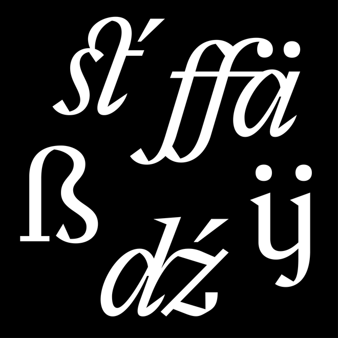


Website
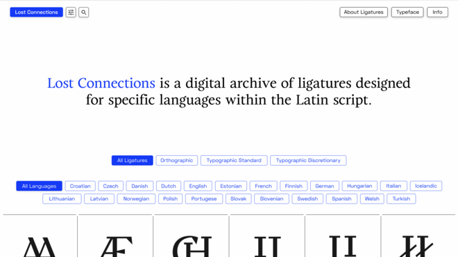
Lost Connections website is an online platform collecting examples of language-related ligatures, providing an opportunity for inspiration and a deeper insight into the phenomenon of language-specific ligatures.
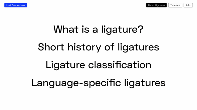
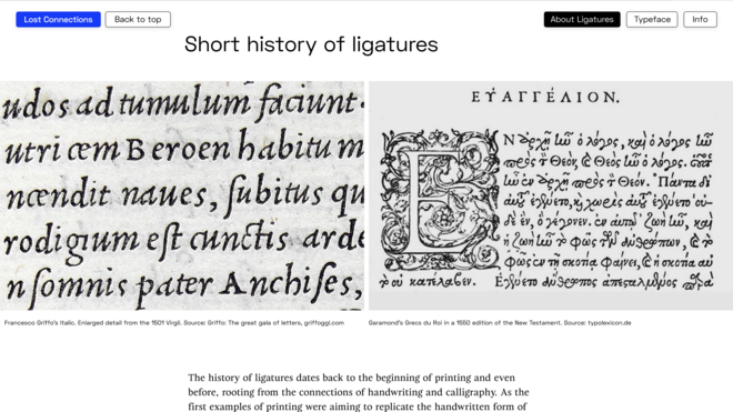
The website consists of 3 main parts: ligature gallery, which can be filtered by the type and adaptation to specific languages, a theoretical part devoted to ligatures in the form of an article, and a typetesting subpage that allows to test and download the typeface.
The platform also aims to draw attention to the issue of ongoing dominance
of English and the unification of typography in contemporary design.


Det Kongelige Akademi understøtter FN’s verdensmål
Siden 2017 har Det Kongelige Akademi arbejdet med FN’s verdensmål. Det afspejler sig i forskning, undervisning og afgangsprojekter. Dette projekt har forholdt sig til følgende FN-mål