Season's Edge: A comic pipeline
When we think of pipelines, we often think of video games, digital development, or even manufacturing. Few know that the use of pipelines stretches far beyond what first springs to mind. In the case of Season's Edge, my goal was to combat the ready-for-use, cookie-cutter pipelines that we currently see taking hold of the digital self-publishing frontier of the comic industry.
Season's Edge is a story about redefining yourself in the face of faulty or dying ideals. It begs the question: how do we rediscover our goals in life when the dreams we built them on don't turn out.
With this story and its highly philosophical themes in mind, I set to work developing a set of tools that would help me and any assisting artists in expediting the drawing process, so as to keep up with the already highly competitive market, without compromising on the quality of the visuals themselves.
The project was overseen and tested by four panels and an editor, who gave me feedback on the overall story. The panels consisted of the following:
A culture panel: was tasked with giving feedback on the designs and the story itself, as to avoid misappropriating the Japanese culture and history.
A beta-reading panel: stocked with our projected demographic. This panel was to comment and critique the pages themselves, keeping an eye out for whether or not the story was conveyed properly and clearly. They also contributed to our testing of the reading speeds for different paneling methods.
A comic panel: consisting of two webcomic artists. These two, like the beta-readers, were to give feedback on the reading experience, but with their angle as comic artists in mind.
Reference Material
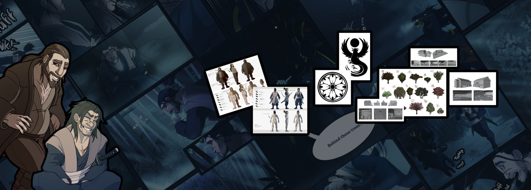
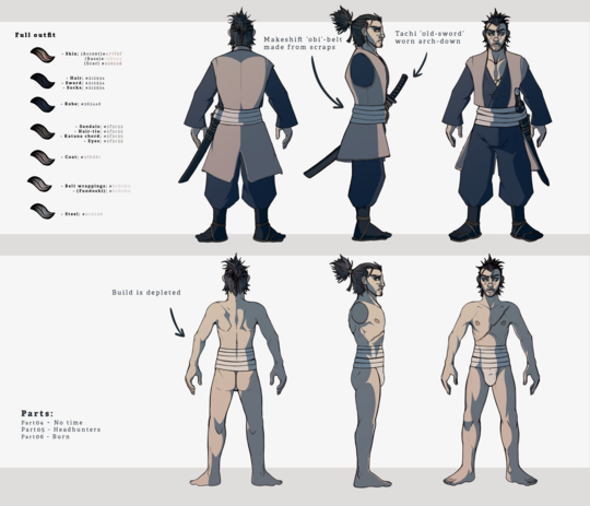
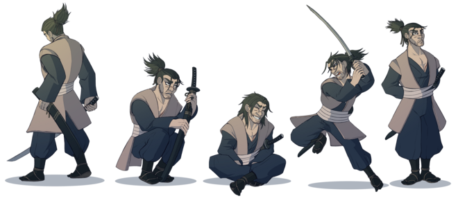
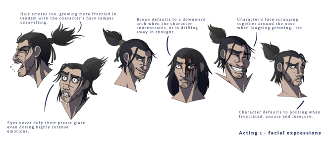
Like any other visual production pipeline, my comic required accurate and high-quality reference material. Especially if I were to pull in assistants to work alongside me. This meant that some of our main character's got very extensive sets of references that could guide even the uninitiated in the project to understand the character’s designs and replicate themselves. These references included the industry-standard Turnaround formats, expression sheets and prop references.
Angle Atlases
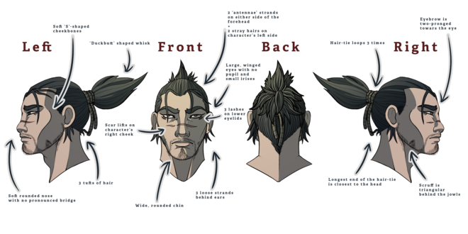
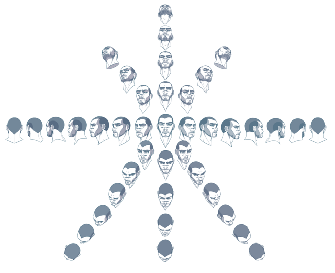
We wanted to make sure the integrity of the character’s anatomy stayed intact, so as to not interrupt our reader’s experience by suddenly going off-model.
So we added a specific part of the character’s references to the pipeline. These we came to refer to as Angle atlases, or just Atlas for short. The character’s faces were roughly 3D modeled in a program called Fuse and then traced over in large atlases. From here, I or my assistant could pluck out the angle we needed for the head of a character and apply it directly onto the page to be traced over later. Similarly, we also used the Magic Poser phone app for posing characters into particularly tricky positions.
These atlases would wind up typically being used for somewhat uncommon angles, such as the 3/4th angles as seen from the back, or when the camera would look at the character from either a bird’s eye view or a worm’s eye view.
Architecture Models
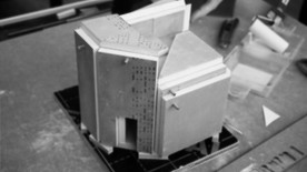
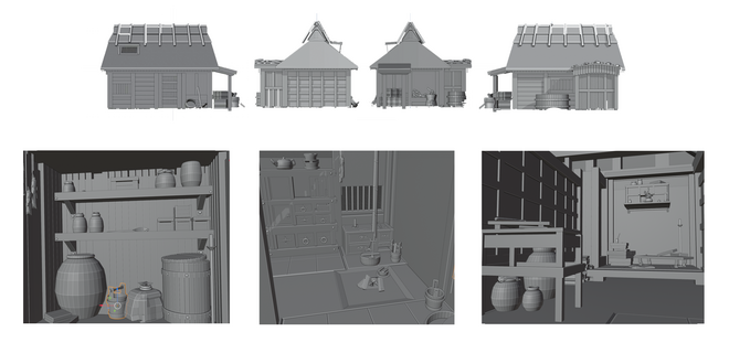
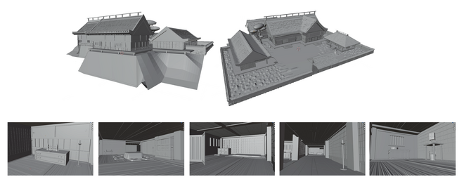
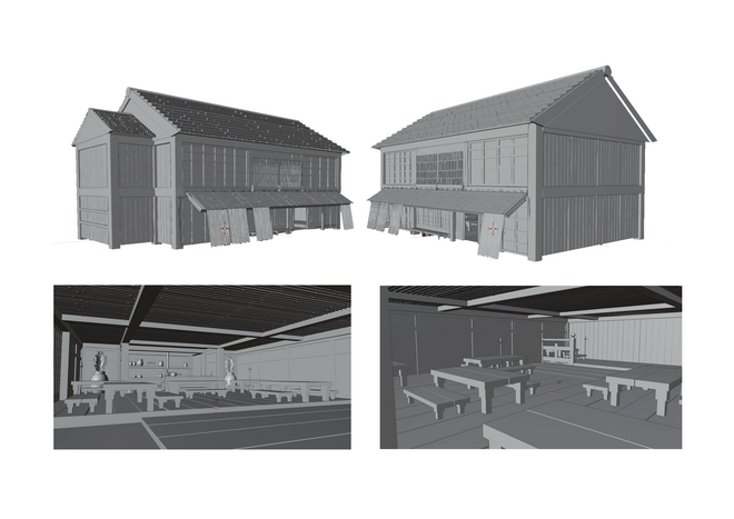
Along with the models from the character’s atlases and the aid from Magic Poser, I build some of the comic’s more architecturally heavy environments in 3D, so that they could be traced over when implemented onto the pages.
This is a common method seen not just in classic comics, but also in the modern, self-publishing industry. Just like the atlases from the characters, these models are meant as a safeguard against immersion-breaking errors in perspective. But also to cut down drawing time per page. However, unlike some of our contemporaries, who we observed pasting the 3D environments directly onto their pages, we opted to still trace over them in the inking stage and manually color them. As to avoid them coming across as impartially integrated into the compositions.
Custom Brushes
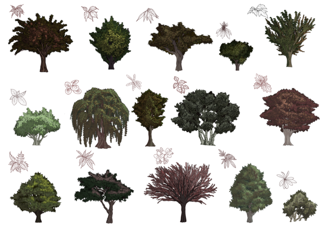
To allow the high level of environmental complexity in our comic’s backgrounds we made a large palette of brushes meant to provide detailed, slightly randomized foliage, textures, and elements to our panels with only a few clicks and a penstroke. We also made a specific brush set for trees and bushes, which can produce about 14 trees which we can alternate between as necessary.
Panel and Pacing
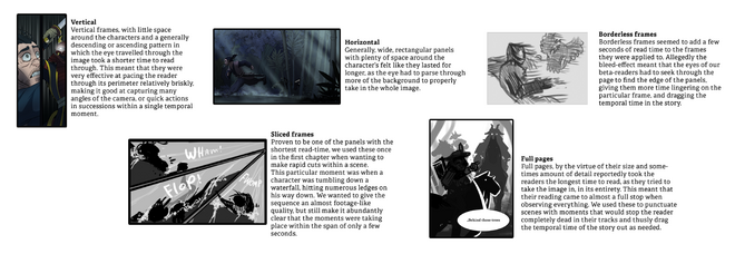
The temporal pacing of a comic comes down to the gutter-space, the size and shape of the panels on a page. Changing these parameters will produce different reading speeds throughout a page. So as I got to use these types of frames throughout the pages, I could in theory control the reader’s behavior when reading through the pages based on the results from our beta-reading sessions. It meant that I had to spend a lot of time planning out each and every scene very thoroughly, as I not only had to account for every action following another rather than happening simultaneously but also how much time I wanted each page to take for the reader to go through, which would physically manifest the temporal time taken in the story into the real world of the reader. It became a lot like choreographing a dance, or a play.
Det Kongelige Akademi understøtter FN’s verdensmål
Siden 2017 har Det Kongelige Akademi arbejdet med FN’s verdensmål. Det afspejler sig i forskning, undervisning og afgangsprojekter. Dette projekt har forholdt sig til følgende FN-mål

