
The Interplay of Typography and Lettering
First and foremost this project reflects my personal journey in graphic design—from a background in graffiti and handlettering, with a focus on illegible abstract compositions, into type design, with functionalism and legibility as guiding principles.
Type design and typography rely on characters & non-visible elements to ensure consistent reproduction. In contrast, lettering adapts to its context and format. It creates images.
In my thesis, i am tying together my own path in type, by uniting these contrasting yet connected disciplines in the typeface Londres with two poles—typographic and lettering.
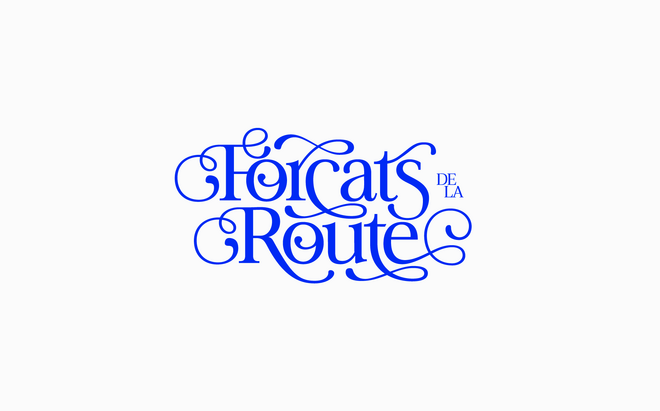
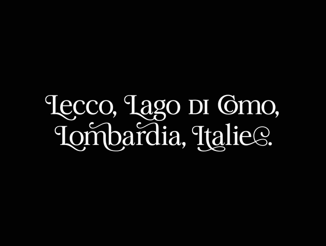
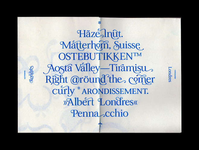
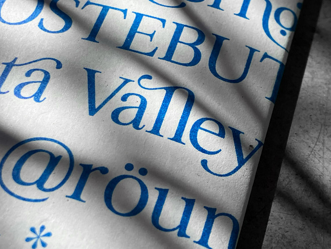
Between the poles, a large range of stylistic alternates allows for a custom level of lettering ranging from mild to wild expressions. All supported by user-friendly coding and OpenType features.
Current trends in type design are driven by two main forces: one rooted in classic, legible text typefaces, and the other pushing typographic boundaries through expressive, ornamental display type. The latter aligns more closely with lettering, prioritizing form over legibility.
My approach varies by context. In typeface design, I focus on consistency and legibility, while in lettering and graffiti, I embrace a freer, more expressive style. With this project, i aim to explore the intersection of these methods—bridging structure and expression in type design.
It has been said that typography is essentially "writing with prefabricated characters" (Noordzij, The Stroke). With my project you’ll be lettering with prefabricated characters.
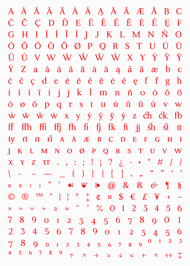
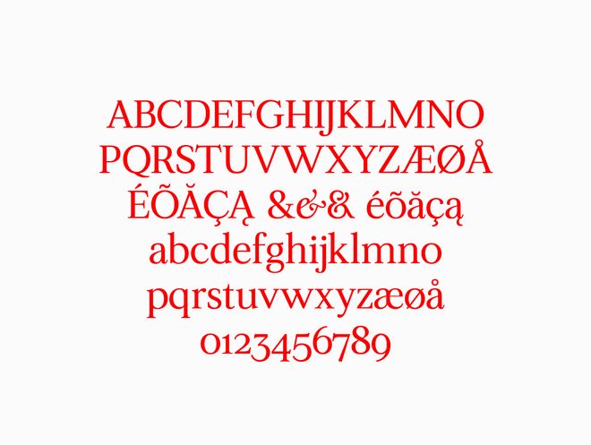
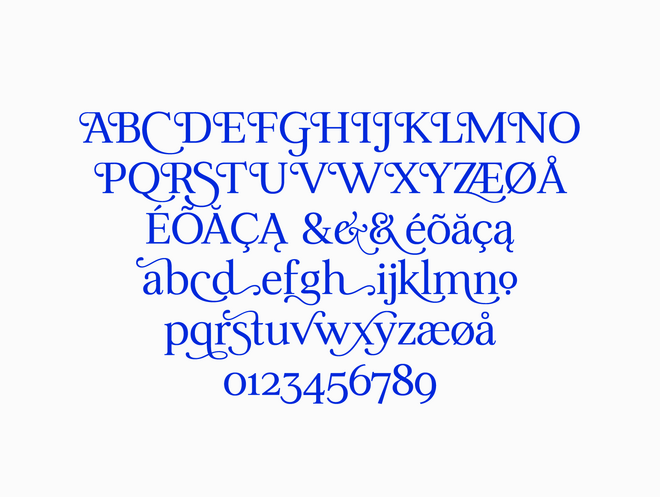
Typeface
Londres is a multi-functional typeface, uniting the beauty of organic lettering with the hard working features of a classic typographic work-horse. On one side its a transitional typeface—on the other, an elegant, chancery inspired lettering type.
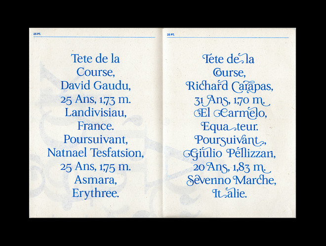
Imagine Lubalin as an italian writer. Or letters as curvy and elegant as the name Giulio Pellizari sounds.
Londres has clear neoclassical traits—elegant, almost ornamental curves, with thin hairlines and orderly symmetry—and subtle hints of old-style calligraphic warmth. For the typographic extreme the goal was a typeface with just enough personality. Too much character would disrupt its workhorse nature, while too little would hinder its adaptability for lettering.
With lettering, I went all out, while maintaining an orderly, consistent approach to it. In essence i am adding elegancy and flourish to typography and order to lettering. As i was creating the intermediate steps, as much as the extremes, descenders and ascenders are as short as possible. So, in most use, lettering alternates can be applied in running text.
The strongest part is the meeting
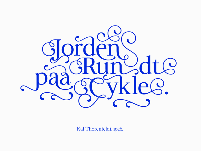
Even though i proved Londres’ worth in creating dynamic lettering pieces, i believe that the strongest part of the design is the meeting between text and lettering within the overarching typographic setting. What i call text with a flair. Lettering behaving as typography.
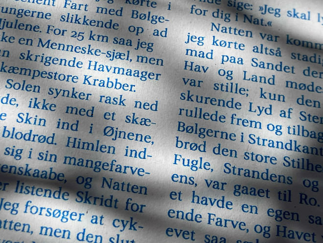
Technically, Londres fits the Scotch Roman category; typefaces revising transitional styles for text use, by mixing them with old-style features. This balance softens its transitional structure, making it adaptable for lettering.
Examining the interplay
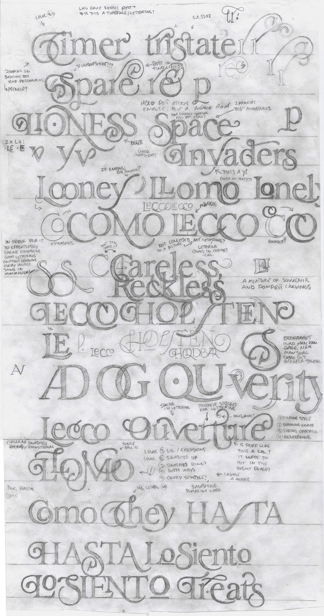
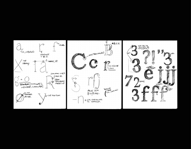
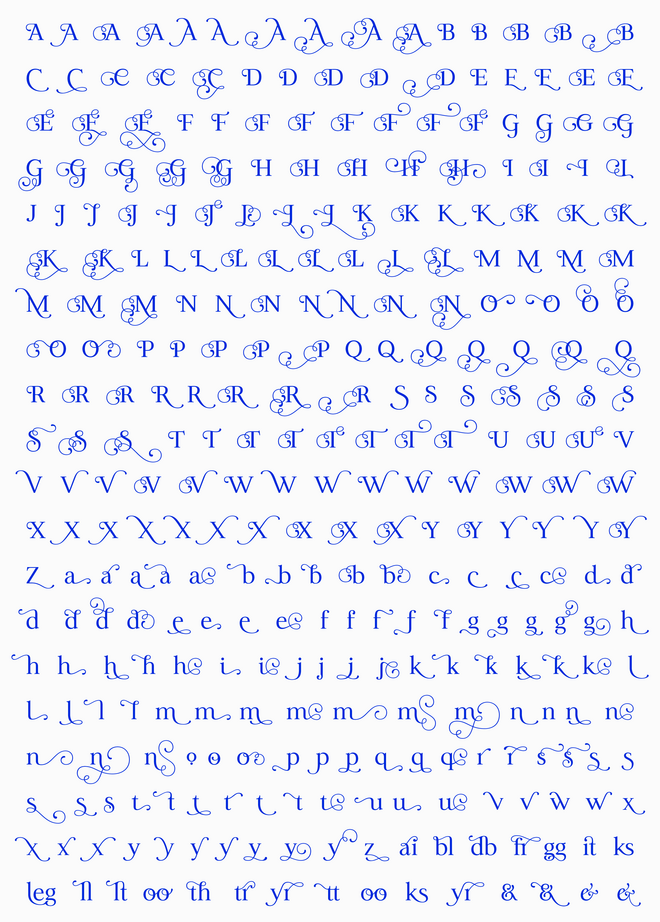
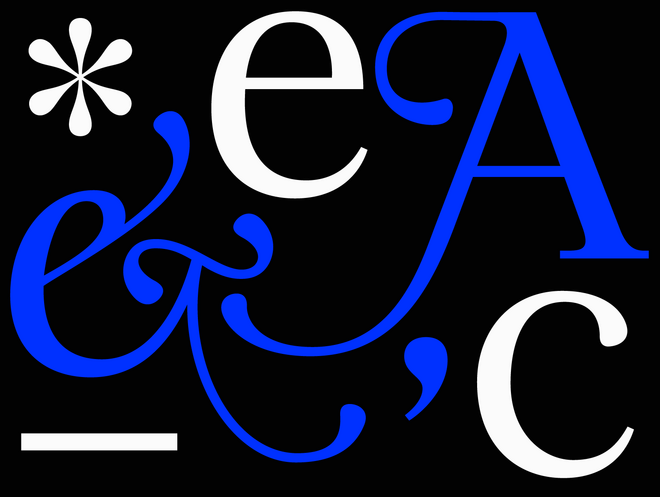
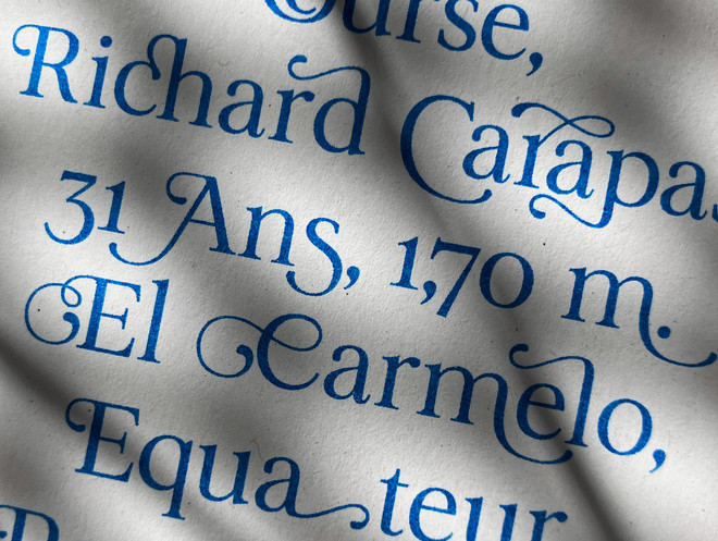
A crucial part of the project was the examination and design of characters forming the span between typographic and drawn letters. This was made via stylistic alternates, alternative characters, with different levels of quirks, swashes and flourish. Beneath is shown a simplification of the levels.
With OpenType features i am enabling a dynamic and seamless use of the typeface. With nearly 300 stylistic alternates, lettering expressions can range from mild to wild. As it is meant for both text and lettering, there is as many lowercase sets as uppercase sets. The alternates are spread out across 20 stylistic sets as a personal curation in letter pairing.
Contextual alternates code prevents clashes between flourished lettering and swashes while ensuring dynamic character exchange, minimizing duplicates and making the font a seamless and dynamic tool for creating text, lettering and everything in between.
Londres
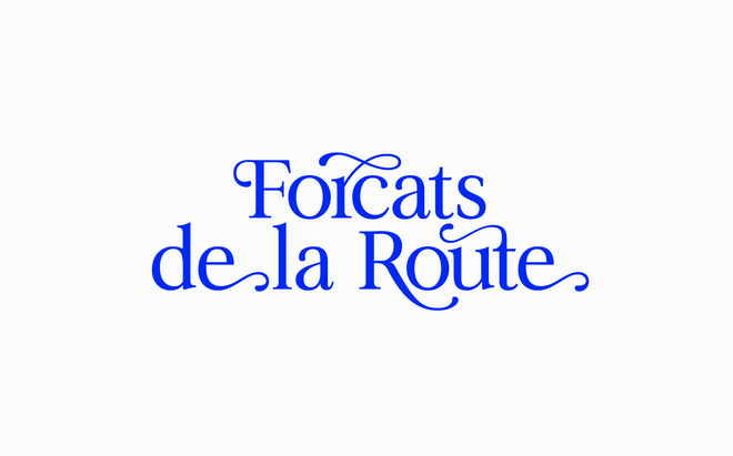
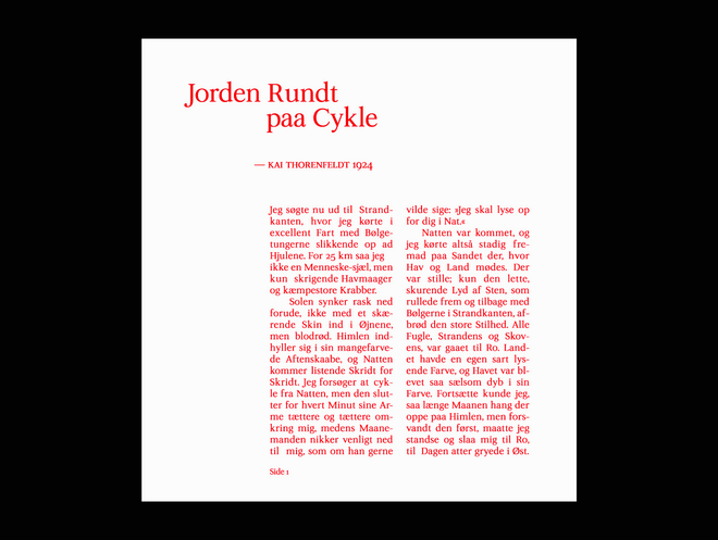
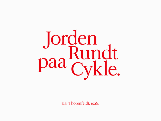
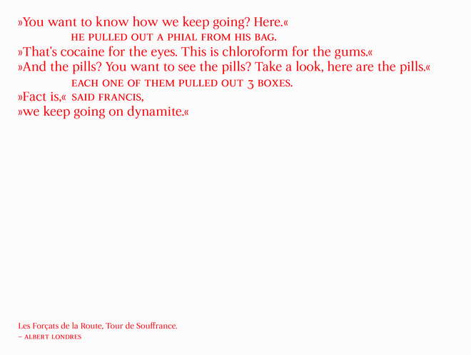
The typeface is named after Albert Londres, a French journalist whose 1924 Tour de France report, "Les Forçats de la Route" ("The Convicts of the Road"), exposed the brutal conditions riders faced, shaping the mythos of the Tour, and brought attention to the hardships and grandeur of professional cycling. The typographic extreme is partly based on Fransk Antikva (Romain no. 16) by french type foundry Deberny & Cie, as found in “Jorden Rundt paa Cykle” (Kai Thorenfeldt, 1926).
Specimen
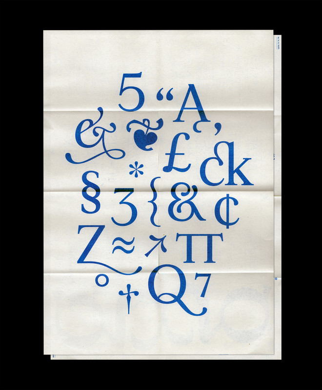
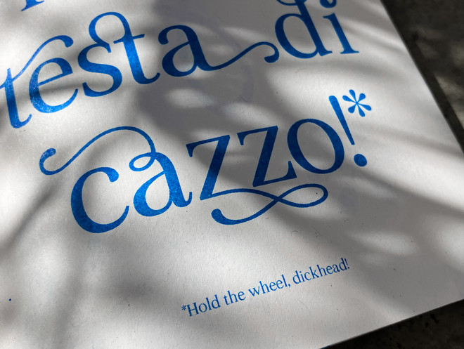
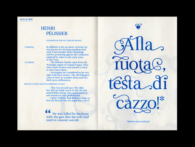
A specimen folder that doubles as a poster. Riso printet on old newspaper, this is a mix of classicism and the contemporary - just as the typeface itself. Specimen on the pages, poster on the back.

Culture that belongs to the people
I care for “folkelighed" as well a sub-cultures. Common culture and the outskirts of it. All the things we share and all the things we didn't know that we share. Maybe that’s why I am fascinated by opposites—also to the extent of making them meet. In design as well as in life. That may, in a strange metaphorical sense, be what this typeface reflect.


